Daniel'sMusicFoundation
- Software+Technology
- ConsumerCulture
Danielsmusic.org – Raising the bar for accessible design.
View live siteCHALLENGE
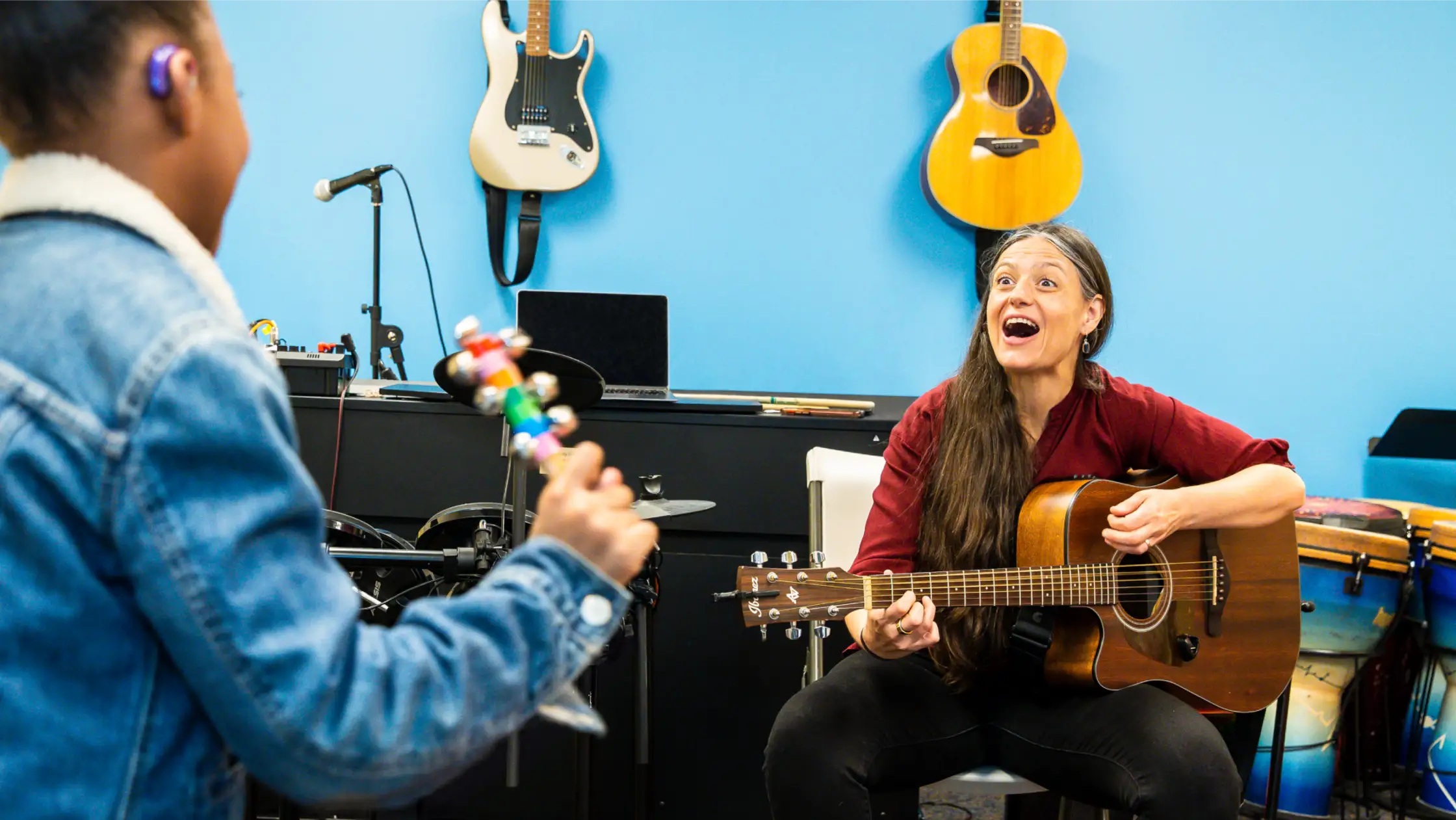
Daniel’s Music Foundation (DMF), a nonprofit empowering people with disabilities through music and awareness programs, has been changing lives in New York City for almost two decades. Since adding online programs to their already popular in-person classes and events during Covid-19, DMF has exploded with the potential to reach people across the world. They needed a website that could keep up, so they came to us for a new one that would not only build trust, share joy and showcase impact, but also be accessible to people of all abilities.
APPROACH
Accessibility is often stigmatized as a trade-off for beautiful, award-worthy design. Our team set out to challenge that stigma and raise the bar of excellence in accessible design.
Instead of approaching accessibility as a checklist of requirements referenced near the end of the project, we approached it in the same way that DMF approached the design of their lively music center: as a creative opportunity to build an enriching experience where everyone can participate in the ways that work best for them – without compromising any of the joy or impact. Rather than modifying an experience for a few, it’s about finding ways to translate it for everyone to equally join the fun.

Accessibility was table stakes. We needed to create a rich—and inclusive—experience. Nothing could be inaccessible, and nothing could be less than great design.
Translating the heart of DMF’s brand to a digital home.
Through colorful visuals, inviting words and simplified navigation, we elevated DMF’s new digital brand to match their vibrant and welcoming in-person presence. We embraced playfulness without veering into silly, conveying the weight of their impact without losing their beautifully human touch.
Alive with color – and contrast.
When colors don’t pass accessibility tests, it usually results in a less enjoyable and usable experience for people with visual impairments. Instead we let legibility needs guide us as we refreshed and expanded DMF’s brand colors to bring energy to the site and reflect the diversity of their community. We punctuated high-contrast neutral colors with brighter pop moments like the cards we designed for their themed online events.


Clarity and connection through voice and tone.
We helped DMF nurture a sense of belonging by crafting a warm, conversational voice with clear language. We treated alt text (text that screen readers read aloud to describe images) as a core part of our copy and thoughtfully chose our CTA language – like using “Play video” instead of “Watch video” to normalize all ways of enjoying an experience.
A system designed around inclusion.
From the beginning, our design system accounted for accessibility in every UI element. We favored a larger scale to better serve users with visual and mobility impairments, included copy for UI elements like “Close” buttons to make actions more explicit, and leveraged subtle motion for special details like hover states to add liveliness without hindering interactions.
Class comparisons made easy.
Music programs are at the core of DMF’s mission. One of our main challenges was organizing the wide variety of information about their classes in a simple and inviting way.
For consistency and clarity, we consolidated information about each class type into cards that stacked on one page. We included colorful pills, an enticing description and concise bullet points for each class to empower users to easily compare and find the best match.


Signing up, simplified.
To streamline the process of signing up for classes, we worked with DMF to organize the info that they needed from potential participants for each class type. Then we created stepped interest forms with a progress bar and conversational language guiding the user through each simple step.


A world of discoverable content.
From impact stats to their teaching philosophy, DMF has a lot to share about how they change lives. Instead of crowding this information on each page, we carefully edited the content into bite-sized pieces that let people explore at their own pace – like learning more about a new friend one conversation at a time.
Showcasing impact with interactions.
We designed colorful, flippable cards with stats about the powerful results of DMF’s programs, leveraging our UI system to make the action explicitly clear. Each card includes a “Flip card” CTA to communicate how to reveal not only more in-depth descriptions of each statistic, but also DMF’s ambitious goals for the upcoming year.
Letting DMF’s thoughts shine, one tidbit at a time.
We embraced carousels to share robust information like community testimonials and DMF’s big-picture dreams. And to ensure they were screen reader accessible, we set clear expectations for the amount of content by indicating the number of slides in our UI. We also designed the cards to bleed off the screen to emphasize there was more to explore.
Animating joy with Daily Smiles.
Inspired by the joy that DMF strives to bring to their community every day, we created Daily Smiles: a smiley-face animation that rolls onto the screen, reveals a quote about inclusion from an original song by DMF’s Co-Founder Daniel Trush, and then rolls away – giving people a moment to smile without getting stuck by the repetitive behaviors that we learned can hinder the experience of some of DMF’s community members.
Accessible Development
We approached every step of development with the same level of thought that we poured into design.
Accessibility testing often happens after components or pages are fully built out, if it happens at all.
We integrated accessibility testing and compliance from the very beginning, using a combination of CI/CD tools such as Lighthouse CI and browser-based testing platforms like ARC Toolkit and Axe Accessibility. For each website feature, we addressed every reported error before committing and merging the code.
We’ve put so much care into designing and developing an inclusive experience, but we’re still learning.
We collaborated with a third-party partner, Inclusive Web, to find accessibility issues in our work and create solutions to fix them.
The Experience we all deserve.
In the physical world, a building is technically accessible if there’s a wheelchair ramp in the back. But who wants to enter through the back door?
In the digital world, an accessible website that’s devoid of beauty – or one that falls short of accessibility requirements – can feel a lot like coming in through the back door. You may be able to experience it, but it doesn’t feel like it was actually built for you.
We wanted to build the digital equivalent of DMF’s gorgeous, lively music center – and greet everyone with smiles and hugs at the front door.
Welcome in.

results
“What an incredible accomplishment! The hard work and dedication of everyone involved jumps out at every click. It is clear how much thought and effort went into every detail.”
- DMF Donor
YEAR OVER YEAR INCREASE IN DONATIONS POST-LAUNCH
37%
Furrion
- Electronics+Hardware
- Retail+eCommerce
Furrion
- Electronics+Hardware
- Retail+eCommerce