Tempo
- Retail+eCommerce

Tempo.fit — Transforming an at-home fitness brand's digital hub
View live siteTempo is an at-home fitness brand that found success with its smartphone-based ecosystem during the early 2020s. In 2023, the brand approached BASIC/DEPT® for help launching their newest—and largest— software update yet: Tempo 2.0. It was poised to transform the at-home fitness industry by allowing for real-time workout guidance based on the user’s biometric and performance data, connected weights, AI, and more.
The Tempo team’s ask was straightforward: refresh the brand and reimagine the eCommerce experience as one that clarified Tempo 2.0 benefits and guided site visitors through a successful, seamless purchase journey. But that evolved into a robust brand transformation; from a complete evolution of their brand strategy and positioning, to an overhaul of their visual identity, art direction, and messaging strategy, BASIC/DEPT® built a comprehensive, reimagined world for Tempo— in less than four months.
APPROACH
Through a consistent partnership with Tempo and deep cross-discipline collaboration within the BASIC/DEPT® team, we developed an agile process that allowed for ongoing strategic synchronicity and unlocked freeflow creativity. We reviewed work as it progressed whenever necessary, and stayed close between strategy, design, and copy to finesse details together for impactful outcomes.
“THE STRENGTH TO SHAPE YOUR WORLD”
Launching a product in a category with steady growth and noise was no easy feat. We couldn’t tell the same stories as everyone else— do “x”, feel “y”. We had to open the aperture of our thinking. So we researched brands outside the category that were making an impact by speaking to ambitions greater than their literal product USPs. And we interrogated Tempo’s impact on its users beyond physical transformation, asking what it really meant to be strong.
The answer was clear: Tempo was about helping you get stronger for yourself, yes, but also allowing you to show up for those you love, and to make the most out of the little moments. Tempo gave you the strength to shape your world.
Art Direction
At the time, Tempo’s overall aesthetic was the standard, overly minimalistic startup style, with the matter-of-fact voice and tone. The Tempo team encouraged us to really push their boundaries when it came to identity. So instead of exploring overall stylistic approaches, we crafted an exhaustive design language, outlining guidelines around things like texture and noise, color, and more.
Content Maps
Content maps were key to ensuring Tempo’s story was full and complete while highlighting the sophisticated details of Tempo 2.0. We considered the webpages carefully, leveraging the new voice and tone developed during our strategic work to craft detailed narratives for each.
We also mapped out a comprehensive plan for content placement, outlining the content type (static photo, full video, or GIF) and focus (lifestyle, workout, product). This, alongside the new photography and cinematography guidelines, helped inform a beautiful new collection of visual assets for Tempo to use across channels.
Design
As we moved into page design, we simultaneously crafted prototypes that assessed the fidelity and quality of our feature and functionality recommendations. The team explored over 25 motion variants for the new site. This allowed us to tweak designs as we went, perfecting not only the site’s look, but how it felt to move through each page.

Mobile Experience
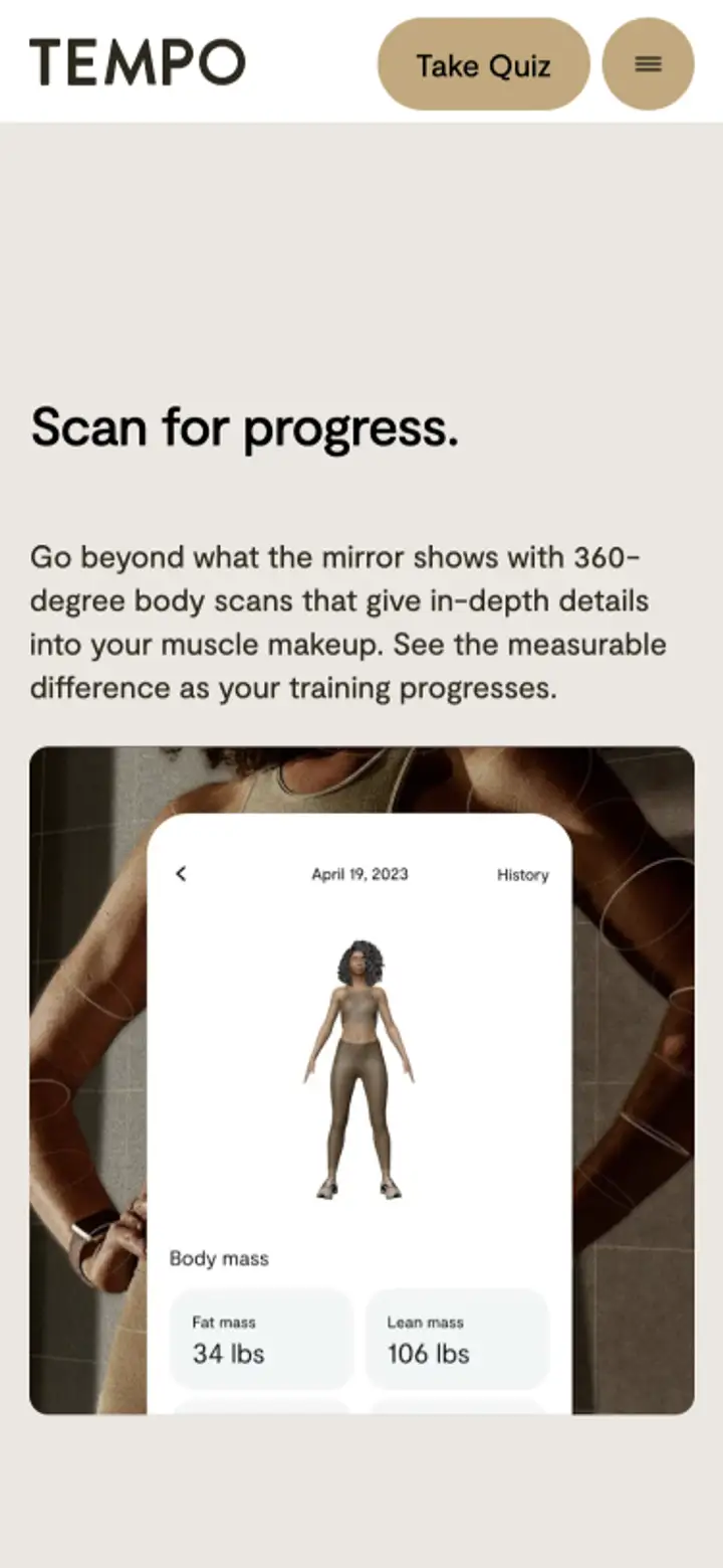
80% of Tempo site traffic comes from mobile devices, so it was critical to have a mobile-first experience. All designs were tested and prototyped in a mobile environment in addition to desktop, to ensure design and motion fidelity as well as accessibility on a mobile device were always accounted for.

Life after launch
Our work has been translated and integrated into channels beyond the website. Brand elements like iconography, textures, and colors were applied to social posts, newsletters, and brand announcements, and often paired with new copy influenced by the voice and tone guides our team developed.

Docusign
- Software+Technology
Docusign
- Software+Technology

